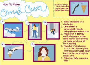
How to Make Cloud Cream

a childhood fantasy
This was a childhood fantasy of mine 🙂

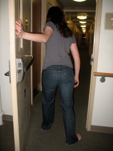
original photo...

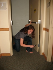
original photo...

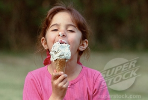
original photo...
This entry was posted on Thursday, October 1st, 2009 at 12:37 pm and is filed under Uncategorized.
You can feed this entry.
You can leave a response, or trackback from your own site.
everything works really well in this diagram as a whole, the combination of the cloud outline arrows, cursive title text, and cloud bubble steps are what make it so dynamic.
The colors you used are… appetizing? Good choices for when you are working to present something meant to be eaten. Nice job and concept!
Love how the arrow guiding us along forms the contour of a cloud. Text is almost useless– the images do the work for you. Very well done. The color scheme is very creamy– kudos for the purple by the way. It reminds me of black raspberry. Mmmmm…
Good work. =) I don’t think the text is necessary, I almost didn’t realize it was there. I think a few shadows on the face might help, but I wouldn’t worry too much about it. It’s all pretty cohesive.
I agree I think the text is not necessary, perhaps you could use that space to experiment with cloud flavor combinations: cirrus, cirrus stratos, altos cummulus.
i love this! so cute and i love the idea, I want some cloud cream! I think you did a great job making the clouds a key theme throughout the piece with the arrows and the numbers. I really like the colors and I think you did a wonderful job on the images. It looks great!
The arrows are great, the fonts work well. I love the font you made to write “Cloud Cream” in. The color scheme is a little abrasive for the concept. The cloud coming in front of the ing in slide one is a bit odd. I like the word “cumulous”. Cummulus isn’t a word. That sounds dirty…
neither is cumulous. cumulus is the word lol
“the color scheme is very creamy” hahaha
I really like the ongoing theme you have here. The colors all match up well and remind me of the upbeat mood of walking into ice cream shops as a little kid. I remember always wishing that clouds could be ice cream 🙂 All sorts of things can be made out of those fluffy cumulus friends. What doesn’t look like it’s really necessary here is the text. Your images are so well organized and put together that perhaps you don’t even need it. I also really like your title. Nice handwriting – it looks like you downloaded a typeface.
I liked this idea because it was something that i think every person has thought of as a kid at one point but usually forgets about and it was nostalgic looking at your picture
the plane looks really good. and i really want to ear some cloud cream right about now. i think this would work without any text…it might make it more childlike- even though it already is. which i like. very nice job!
Don’t put facial features in, the drawings don’t need them. Very clear, very successful. I like the list of necessary equipment.
wow thats an amazingly fun concept. yeah get rid of the words
I love this!!! I want some! I’ve always wanted to touch clouds so this is really great. Every aspect of your design is cohesive in the cloud theme, the ‘Cloud Cream’ text. the number cloud boxes, the cloud-like outline of the arrows, and the cloud shape of the ice cream. I like the ‘what you will need’ box and the side justification of the text. Your color scheme is good for the idea too.
Cloud Cream!!!!!!! my favorite.
My childhood fantasy was eating cotton candy made out of cloud. I like the layout and colors. They really works well creating creamy feeling in cloud and ice cream.